Building Ubud Taxi Service
February 01, 2019Web Development
Keyword Research
The first step I took for this project was to perform keyword research. I have experience with Google Adwords and the included suite of tools from previous jobs, so this step was quite easy for me. I used the Google keyword planner to find out what search terms are popular for finding a taxi in Bali, and what type of traffic they could potentially generate.
During my research, I found that “Ubud Taxi”, “Taxi Ubud”, “Ubud Taxi Service”, and variations of these names consistently had the highest volume of searches.
The .com domains for the first two terms were already taken, but “Ubud Taxi Service” was available. I decided to purchase the “ubudTaxiService.com” domain and I think this site can reach the top of Googles search results for the previously mentioned terms if I focus on search engine optimization (SEO).
Website Planning & Design
I’m going to create a basic, lightweight responsive site. The site will use CSS Grid for responsive design, and I will use basic javascript to make the site more interactive.
I determined the target user group (tourists in Bali) and made two assumptions about their behavior:
- They will be searching for cabs while they are on the go.
- They don’t have laptops with them since they are on vacation.
For these reasons, I will design the website for a mobile-first experience (while still providing a great tablet/desktop experience through responsive design).

I plan to break the site into 5 main categories: Home, About, Services, Photo Gallery, and Contact.
If I have trouble breaking into the top search results or if competition increases over time, I may add a blog section. Based on the current competition, I don’t think this is essential for the initial release.
I’m going to focus on keeping the design simple and making the site easily navigable. I think most customers will appreciate a well-designed website and this alone could be the difference for which cab service they choose (I know when I’m traveling I typically associate a well-designed website with a well thought out and polished business model).
Once I have a nice layout and basic content generated I’m going to show the site to Dewa, work on producing additional content, and tweak the site to include specific information about Dewa and Ubud.
Technology & Site Structure
I decided to use CSS Grid, Flexbox, and different media queries to make the site responsive. I know that the sooner I can get the site hosted, the better I will do in the search rankings (the age of the domain and site reliability play a large part in making it to the top of Google’s search results) so my initial release is going to be very basic.
After I had the basic design coded, I decided to implement a “hamburger” navigation menu. The menu I’m currently using isn’t terrible but it takes up a lot of space on mobile devices, and I think it will be a fun challenge to implement the new navigation style.
I used a tutorial titled “Responsive Menu With Media Queries (Checkbox Trick) - Using Only CSS3 Tutorial“ from Youtube. It was pretty straight forward and I initially implemented it as shown in the tutorial. After seeing how the menu fit into my site, I decided to optimize it and made several improvements.

I changed the colors, which are now slightly different than the rest of the page, and I think this helps it stand out more. I made the navigation menu “stick” to the top of the page, used javascript to make it disappear when the user scrolls down, and reappear when they start to scroll up. This saves a lot of space on mobile and utilizes the limited amount of screen real estate.
I also added a bit of javascript styling so that the links are colored when the user hovers over them. Although these are minor tweaks, when combined they help to create a much better user experience.
Going Live and Hosting
I’ve created a few webpages in the past and my goto host for static websites is StableHost. I upgraded my hosting plan with StableHost and pointed the nameservers on NameCheap (where I bought the domain) to the right location so the website will now be live!
I sent Dewa a message on WhatsApp letting him know that the site was live and requested some pictures for the photo gallery section. He sent me 10 pictures of happy customers and a few pictures of him with his children. These will be perfect for the site.
I’m excited to finish this project, and if things go as planned, I think this site could really help Dewa.
CSS Tweaks and Adding Custom Pictures
I put the images Dewa sent me through an image compressor. It’s essential that this site loads quickly for both the user experience and the search engine rankings. After the images were compressed I uploaded them to my Cloudinary account and created custom links for each picture in the photo gallery.
Cloudinary is a great service and I enjoy having the ability to “transform” each image through the URL link I use (you can change the height and width along with many other variables).
When I finished adding the pictures from Dewa to the site I noticed that at certain screen widths the pictures towards the bottom of the page were off-set. I used a series of custom media queries to fix this issue and everything fits together perfectly now!
Search Engine Optimization (SEO)
The main goal of this website is to rank #1 in the Google search engine results for “Ubud Taxi” and “Ubud Taxi Service”. The only way this can be accomplished is by performing SEO. Since the site is already live, I want to start working on SEO as soon as possible.
I ran a free SEO audit by SEOptimizer.com and reviewed the results. This didn’t provide me with a lot of new information but I was able to fix an error where multiple elements had the same ID and replace them with new classes that did the job just as well. After this, I linked the site to the Google Search Console (which I have experience with from previous sites) and created a sitemap with XML-sitemaps.com
I love everything that goes into a website after the initial design is finished and I think it’s fun to continually iterate through a design while optimizing for performance and usability.
Additional SEO Research
After researching SEO auditing tools, I discovered a recently released site from google called web.dev. This site performs the same functions that the “Audit” tab of the Chrome developer tools does, but it is packaged in a nice format and provides links to help you improve your SEO. I ran the test and discovered I have a lot of room for improvement.
If I want to reach #1 in the Google search results, the site will need to be fully optimized. Since it will take a while to climb the rankings and gain visibility, I don’t improving the content will pay off until this is taken care of.
SEO - Content Best Practices
I learned several new things while updating my web page to comply with the advice from the Google SEO audit. Following Google’s recommendations from the audit improved my SEO rating to 100/100.
Page Performance
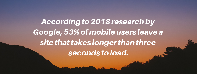
My site only scored a 76 on this section and I know it is a very important factor in SEO rankings (and also contributes to improved usability). This is something that needs to be ranked 100/100 if I want to get to the top of the rankings and provide users with a smooth and hassle-free experience. The faster a site loads, the higher it will rank in search results, and the more likely users are to stay on-page and not exit for an alternate site.

The two main improvements I made was to Defer Offscreen Images and Properly Size Images (serve responsive images)
Deferring Offscreen Images is a technique that only loads images that are above the fold (images you will see when initially loading the page). Javascript is used to detect scrolling on the page and only loads images when they are about to be viewed. Doing this results in a faster initial load time for the page, and saves user bandwidth until it is actually needed.
Properly sizing images is the idea that you should only serve the file size that is required for a certain view and you shouldn’t load a full-size image for a mobile version of a page. This seemed complicated at first, but after reviewing the MDN docs explanation, I understood how to solve the issue.
Adding New Pages and a Favicon
After improving my pages performance, I created an “About” page and added a Favicon to my site. As a web developer its important to use the tools at your disposal, and I found a site called “Favicon Generator” that made things very easy.
I also plan to add a “Services” page, but I can’t create it until I receive more information from Dewa.
Summary
There are still a lot of improvements to be made to the site and further optimizations that can be worked on. I’m happy with the current progress that’s been made and I will wait to see how the site responds to Google’s search ranking algorithm before making any additional changes. Check back for future posts about the continued development and marketing of this website!